Font
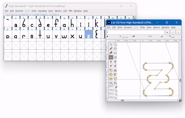
On my high school trek to find all the best open-source software, I stumbled upon FontForge. I thought back to one of my favorite television characters, Brick from The Middle. He was fascinated by fonts, and now I had the chance to make one!
 I started without a moment's consideration for studying what makes a good typeface. Inkscape was my go-to tool, and I tried to standardize sizings. I wanted a font that would reflect my distinct handwriting style. Slashes through simpler anyone ever slashed!
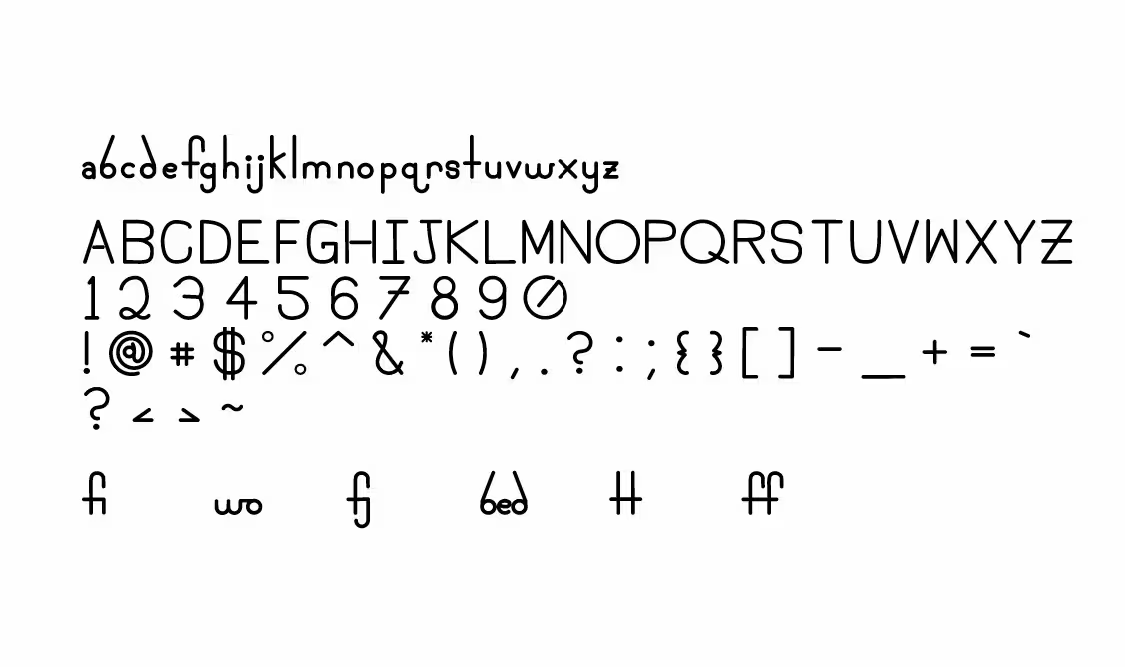
It could have been made bolder for sure, but I think the result is not bad at all. It looks illegible in a terminal sadly, but for something I had never done I have no regrets. I added nice ligatures, which is when two characters connect. For instance, some fonts connect "f" and "i" to make "fi" look better.
I made custom caret spacing for the font, which was really a patch for what I meant to be a monospace. Shoot me a message if you want to try it out!